ORANGE TOURS - WEBSITE OVERHAUL
Three heritage river brands needed one digital front door. I designed the information architecture, wireframed the booking paths, and crafted high-fidelity pages that make booking a river trip feel clear, whether you start by river or by activity.

ROLE
Senior Web Designer
TIMELINE
10 weeks
DELIVERABLES
Site map, wireframes, hi-fi UI
TOOLS
Figma, FigJam, Webflow
Impact Metrics
2 Paths
Browse by destination or by experience
1 catalog
Shared trip inventory across three brands
CTA Boost
Replace with real inquiry / booking lift
Overview
Orange Torpedo Trips, Briggs Rogue River Trips, and Whitewater Cowboys each had decades of trust on the water, but separate websites that made the full offering hard to see. Visitors bounced between brands, duplicated content, and competing calls to action.
I owned the web design track end to end: mapping a combined site structure, wireframing the critical discovery and inquiry flows, and delivering high-fidelity designs that preserve each brand’s identity inside one coherent experience.
The Challenge
The problem wasn’t a lack of trips. It was a lack of a mental model. Guests didn’t know whether to search by river, by activity, or by the outfitter name they already trusted.
Three brand sites with overlapping inventory and no shared navigation
No clear answer to “where do I go?” vs “what do I want to do?”
Weak hierarchy and competing CTAs on marketing pages
Mobile treated as a scaled desktop layout, not a booking path
Orange Torpedo

Briggs Rogue River Fishing

White Water Cowboys

Goals & constraints
DESIGN GOALS
Let guests browse by destination or experience without building two catalogs. Keep each heritage brand visible. Make “Find Your Trip” and inquiry the primary actions.
CONSTRAINTS
Content lived across three businesses; SEO equity mattered; the site had to feel adventurous without looking reckless — families and first-timers needed trust signals.
Design Process
Map the site
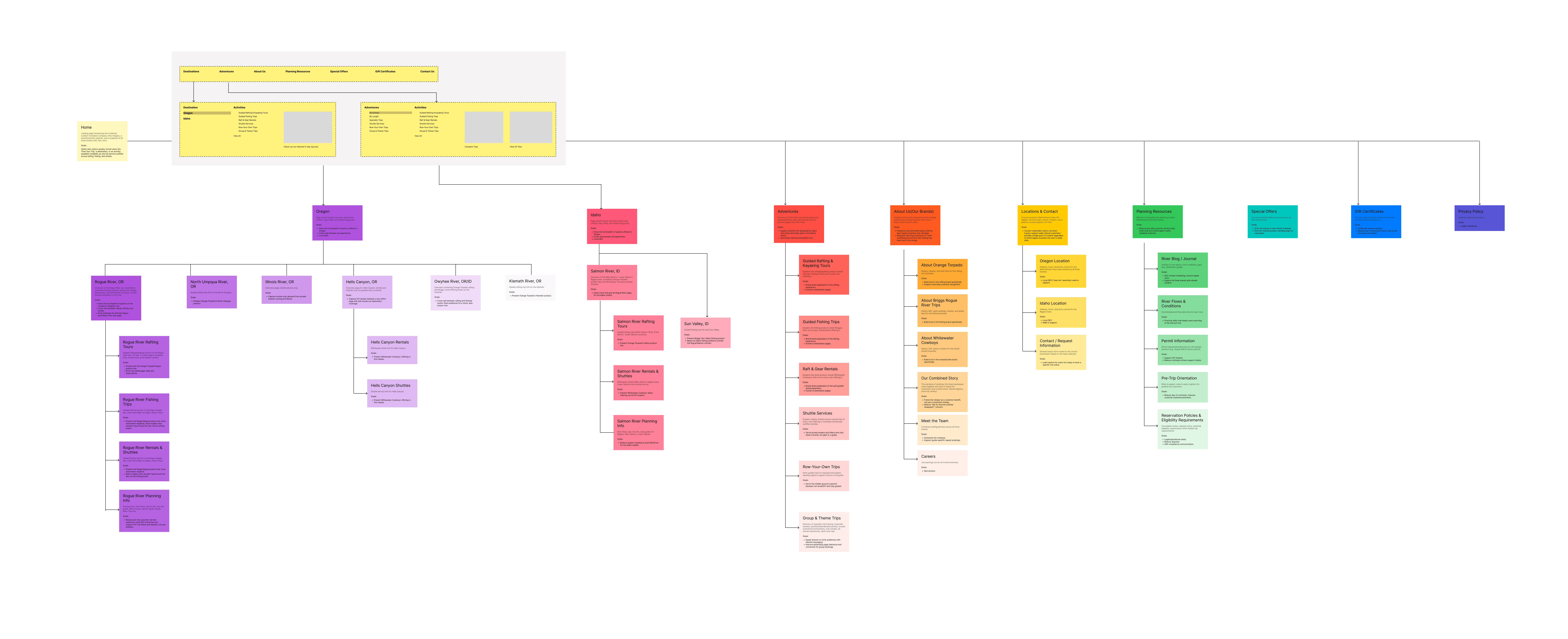
Built a combined site map with destination hubs, experience hubs, brand stories, and shared planning resources: one inventory, two entry points.
Wireframe critical paths
Explored layout and CTA hierarchy for Home, Find Your Trip, Destination, and Trip Detail before committing to visual polish.
Design & refine hi-fi
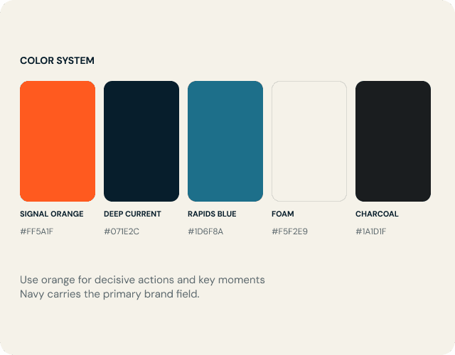
Applied a bold outdoor visual system, then refined responsive breakpoints and handoff specs for production.
Information Architecture
The site map organizes the business around how guests actually decide: pick a river, or pick an activity. Both paths resolve to the same trip pages, so nothing is built twice. An “Our Brands” section protects legacy equity for returning customers.
WHERE
Destinations hub → river pages → rafting, fishing, rentals & shuttles
WHAT
Experiences hub → tours, fishing, rentals, shuttles, group & theme trips
WHO
Our Brands → Orange Torpedo, Briggs, Whitewater Cowboys, combined story
Wireframes
Low-fidelity frames locked content priority, scroll rhythm, and conversion moments before color and type entered the conversation. The goal: prove the IA works on the page.
Home - hero, trip finder entry, brand snapshot

Find Your Trip - filters for river, activity, length

Destination - services available on one river

Trip detail - itinerary, trust, primary CTA


Hi-fidelity Designs
Final screens translate the wireframes into a polished marketing experience: editorial hero imagery, scannable trip cards, and a persistent path to inquire or book.
Clearer IA
Dual browse paths without duplicate content or dead ends.
Stronger hierarchy
One primary action per view; secondary links stay supporting.
Conversion patterns
Trip finder, destination hubs, and detail pages share CTA logic.
Home - hero, trip finder entry, brand snapshot

Find Your Trip - filters for river, activity, length

Destination - services available on one river

Trip detail - itinerary, trust, primary CTA

What I learned
Merging brands on the web is an IA problem before it’s a visual one. Once the dual browse model clicked, every page pattern got simpler — and the hi-fi work could focus on trust and energy instead of fighting structure.
Next, I’d pressure-test Find Your Trip with real guest interviews and tighten SEO landing templates for each river and activity pair.